
If a picture is worth thousand words, then what about a neat data visualization? Displaying information in graphics to generate better insights is not a new phenomenon, but, with the advent of technology and increased access to data, it has become far more prominent. Once restricted to analysis of economics, finance, and science, data visualization has emerged as an industry of its own.
There are now multiple tools to visualize data, competitions for visualizations, and even data visualization artists. From a haunting depiction of gun violence in America and an assessment of India’s RTE Act to a series of charts highlighting a footballer’s greatness and a collection of maps depicting India’s size, data visualization transcends fields — all data can be visualized.
Data in the eye of the beholder
Why visualize data? Beyond the mere aesthetic attraction of a beautiful graphic, data visualization matters because it can be extremely helpful. It is easier for the human brain to process large volumes of data through visuals rather than text. Studies have shown that humans find it easier to distinguish line length, shape orientation, and color — collectively known as pre-attentive attributes — than read a series of numbers. This is because around two-third of our brain’s neurons are dedicated solely to vision. This makes it easier and quicker to interpret information visually.
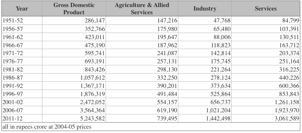
Take the example of India’s GDP since Independence. The narrative is a familiar one. After Independence, Indian economic growth was anaemic (rarely hovering above 5%). It was only in the late 1980s and 1990s that growth really accelerated, driven by a tremendous increase in services output. Below are a table and graph conveying this same information, but the graph tells the story in a way that’s both more intuitive and informative.

Data visualization allows us to identify these sorts of trends, along with problems and possible solutions. This makes it a valuable tool for anyone — especially those working in policy. Policymakers use swathes of data across sectors to make important decisions. In this ocean of information, data visualization can quickly show them what needs to be refined or aborted. In a country as diverse and large as India, data visualization’s ability to show data effectively and quickly is paramount.
Data visualization for policy
The Government of India has embraced the potential of data visualization. As part of its Open Data platform, public users are encouraged to create their own visualizations to show different perspectives on government performance. Some ministries are going a step further by implementing their own data visualization initiatives. For instance, the Ministry of Rural Development has created a dashboard on MGNREGA implementation (the Indian government’s flagship workfare program). The dashboard has an intuitive interface that provides administrators with real-time visualized summaries of the program’s performance at all administrative levels (from gram panchayats to the center).
At Atlan, we work with all sorts of decision makers to create intuitive data visualizations. For example, district collectors and other government officials use our platform to create dashboards, which provide important insights to help officials identify pain points, assess their progress, and target important schemes or initiatives to the places that need them most.
Below is an example of a data visualization from the Socio-Economic Caste Census — a nation-wide survey of socio-economic conditions of households across India.
The map above shows the proportion of rural households with kuccha roofs (thatched, plastic, or hand-made tiled roofs) in every district in India. The same data could have been described in words — for example, districts in Chhattisgarh, Odisha, and Madhya Pradesh have the highest proportion of kuccha roofs while districts in the South have the lowest, and so on. However, all that information — and more — is revealed through a quick glance at the map.
Many people now say that we are living in an era of big data. By some estimates, we are generating 2.5 quintillion (that’s 18 zeros) bytes of data daily. This data can be used for amazing policies and initiatives. However, for this to happen, data has to be managed and interpreted correctly.
Image by Maxbo10 – own work, CC BY-SA 3.0, link.


3 Comments
Pingback: Why Visualize Data? - CloudJocks
Pingback: Why Visualize Data? - Launchship
Great Article.