
Whether you are looking to improve your business performance or measure the effectiveness of policy decisions or simply enhance processes in your organization, choosing and tracking the right metrics is vital. This is where Key Performance Indicators (KPIs) are extremely useful.
At Atlan, we have had the opportunity to work with a wide variety of high-level decision makers who look to track different KPIs that shape up day-to-day decisions in their respective organizations. Over time, we have discovered that while KPIs are critical for every organization, they are often misunderstood or misrepresented, leading to inefficient decisions.
Here’s a one-stop guide that will help you identify and visualize the right KPIs for your specific goals and make great decisions. Let’s get started.
What is a KPI?
Every organization has a bunch of metrics that they want to track. Lesson 1: Every metric doesn’t qualify as a KPI.
A metric could be a number (for example: page views on your website, quarterly sales, or number of workers who received employment under a skill development program) or a ratio (website visitors to client conversion rate, sales as a percentage of target, or percentage of workers covered under a skill development program).
A metric would translate into a KPI only when it can lead you to concrete actions that can help your organization achieve its broad goals.
A KPI is a measurable parameter that demonstrates the level of achievement of a target. What this means is that a metric would translate into a KPI only when it can lead you to concrete actions that can help your organization achieve its broad goals.
For instance, the number of page views on your website is not a KPI because page views do not necessarily have a bearing on your broad goal: ensuring client conversions from website visits. You might have a very high number of visitors on your website but barely any of them converting to actual clients. In this situation, the website visitors to client conversion rate is the right KPI for you.
Now that we have a basic understanding of what a KPI actually is, let us delve deeper into the various types of KPIs.
Quantitative KPIs
Quantitative KPIs are straightforward, since they are made up of measurable numeric metrics and help you track clearly measurable progress. For instance, the Right to Education (RTE) Act in India has guidelines on infrastructure and learning conditions that every school in India must comply with. Tracking the implementation of these guidelines in over 1.4 million schools at a national-level would have been a nightmare without clearly defined KPIs.
We helped Oxfam India identify KPIs that track the implementation of RTE guidelines and look at the percentage of schools in each district with facilities such as toilets, ramp, playgrounds, and so on at a district-level. We then tracked these KPIs using progress bars and a map view.

Qualitative KPIs
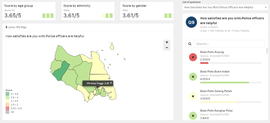
KPIs aren’t always about measuring quantitative aspects of your organization. You may also want to track some qualitative aspects. For instance, the Malaysian Police wished to understand public perception of safety in various Police districts, to ensure that people of all races and ethnicities felt safe. Challenging as this was, we learnt that quantifying qualitative data using the Likert scale or other similar tools, greatly helps in measuring and tracking qualitative KPIs.
In this view, the right panel tracks the public perception of the helpfulness of each member of the police force on a scale of 1 to 5, where 1 stands for not helpful at all and 5 stands for very helpful.
Process KPIs
Sometimes, when different processes feed into each other, a funnel view is a better way to understand the overall flow than tracking individual KPIs for each process. For instance, the Mahatma Gandhi National Rural Employment Guarantee Act (MGNREGA) — a program by the Indian Government to allot jobs to eligible Indians — is a complex program with lots of moving pieces.
We learnt that a funnel view makes it easy to diagnose problems in a complex program like this. In this case, while work has been allotted to 99.6% of individuals who demanded employment, only 2.3% of them actually completed their 100 workdays.
This clearly brings out the bottleneck: a lot of individuals who begin working do not complete their 100 workdays. It’s a good starting point for the relevant decision maker to launch corrective action.

Combined KPIs
When you have too many interdependent metrics to track, you can use statistical models to combine a bunch of similar metrics into a score and then visualize them in the form of scorecards. Scorecards give a quick snapshot of what is going right and what isn’t. Your dashboard could then have drilldowns into each scorecard to help you dig deeper into the root causes of the problems that need fixing.
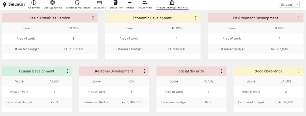
For instance, a Village Development Plan — aiming to ensure 100% availability of hundreds of facilities in every village — needs to track hundreds of individual progress KPIs. In our work with the Tata Trusts, we grouped related metrics into categories — basic amenities, economic development, environment, human development, and so on — and represented them in the form of scorecards.
Based on the score, the scorecard gets highlighted in different colors — red, yellow, and green — to help the decision-maker quickly identify which areas need special attention. The decision-maker can then drill down into the individual scorecard and understand more about specific areas of improvement.
KPI visualizations are becoming an essential part of the way businesses and organizations track their metrics and use those to develop nimble strategies for the future. This guide will help you make sure that you are getting the most value out of your KPI visualizations. Happy data vizing!


