
Data visualization is a great way to represent huge amounts of data in a simple and intuitive fashion. All data visualizations have the same goal: help viewers easily grasp information to make quick inferences or decisions. However, it is important that visualizations are not overdone and hit the sweet spot where they are catchy, informative, and easy to navigate.
This requires a bit of learning. Putting up a good data visualization is not just a matter of throwing together some data in colorful charts. In the course of our work with data visualization, we have seen instances where clumsily executed visualizations become more confusing than helpful.
Here are 5 common mistakes that lead to bad data visualization. Avoid these to get the most out of your data visualizations.
1. Bad Data
There’s an old principle in computer science: “Garbage In, Garbage Out”. In the context of data visualization, this means that bad data will lead to bad visualizations. Start with the basics: is your data clean? Use checks at every stage the data goes through — collection, sourcing, cleaning, and compiling — before it is visualized. Common errors include data duplication, missed data, NA values not marked, and so on.
For instance, in this pie chart, the three sectors of the pie add up to 193%, which makes no sense. Such mistakes in data would render your final visualizations useless.

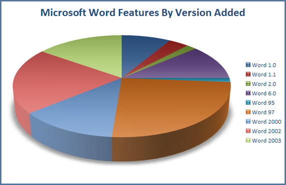
2. Wrong Choice of Data Visualization
Once your data is ready, you should be careful about what type of visualization you use. For instance, in the visualization below, a pie chart was the wrong choice. The intention there was to show how many features a given Microsoft Word version has. The pie chart, on the other hand, shows the proportion of features in a particular version as a percentage of the total features in all versions. A bar chart would be a better choice for this data.
Check out our blog on 5 things you should know before you make a pie chart.
3. Too Much Color or Information
While it has been established that using different colors help people interpret data visualizations quicker, too much color can confuse the viewer. It is important to choose a limited number of colors — 5 is a good upper limit — that are distinct from each other. Thanks to the crazy colors, the visualization below is seriously messy.

4. Misrepresentation of Data
For instance, this bar chart seems to show that the percentage of women covered under a job guarantee scheme more than doubled from 2012-13 to 2016-17. However, when we look at the y-axis, we see that it begins from 48%, not 0%. This misrepresents the marginal improvement of around 5.5% as a 2x increase.

5. Inconsistent Scales
You can, of course, represent multiple variables in a single data visualization. However, it is always a good practice to represent them on a single scale to avoid confusion. For example, the graph below shows bars for the years 2010 to 2012, and then breaks down the year 2013 into bars of four quarters. This could be confusing since the x-axis scale has not been kept standard.

Now that you know the common mistakes that lead to bad data visualization, go make some awesome data visualizations of your own!


7 Comments
Dear Vasavi,
Good afternoon. Nice article, its worth it.
Regards,
Sagar.
Thanks Sagar. Glad it was useful to you. We have more articles on Data visualization coming soon. 🙂
Pingback: The 5 Common Mistakes That Lead to Bad Data Visualization | Social Cops
Excelente articulo! Muy buena información.
Pingback: Links Relevant to Data Visualisation – Data Visualisation
very helpful in my learning situation currently and provide examples and insights.
Dear Vasavi,
Thanks a lot for the information being provided it has been very helpful and I would be glad in case you could share more of it.
Aditya Singh