
Weren’t all of us in our early childhood fascinated by how maps could carry us to faraway continents, countries, rivers, mountains, and oceans? The way we see the world today is largely shaped by the images of physical and political maps that we pored over in our school atlases. In the age of data explosion, mammoth data sets are being generated and compiled. Visualizing geospatial data helps us communicate how different variables correlate to geographical locations by layering these variables over maps.
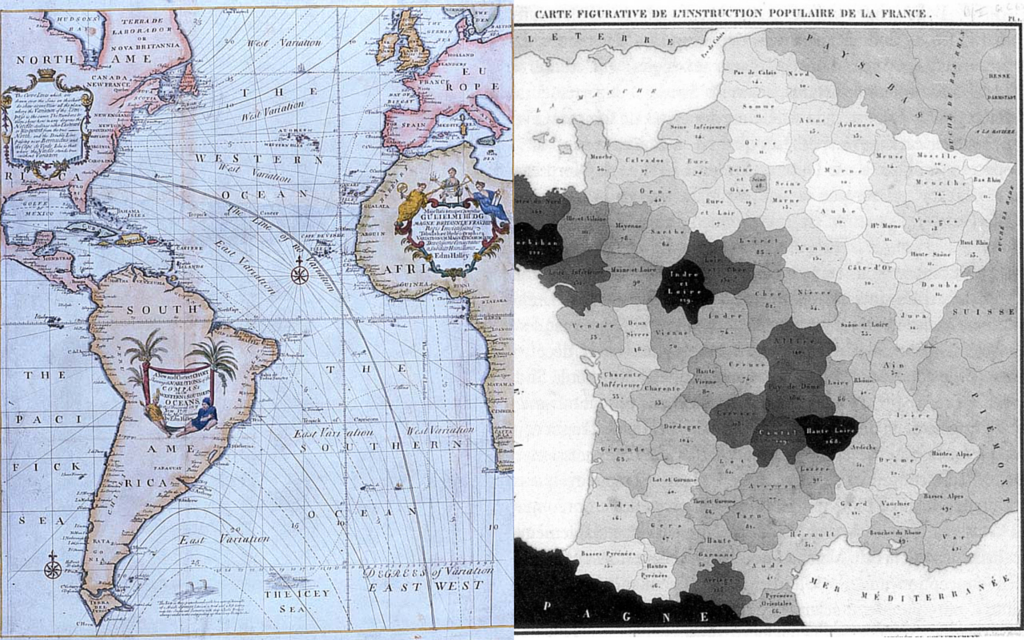
For centuries, maps have been used to visualize a wealth of information in the sciences and humanities. “Milestones in the History of Data Visualization” (compiled by Michael Friendly and Daniel J. Denis, York University in Canada) suggests that geospatial visualizations have been around since the 17th century. For instance, Edmund Halley’s New and Correct Chart Shewing the Variations of the Compass (1701) [left] was the first map to show lines of equal magnetic variation. In 1826, Charles Dupin published a thematic map of France [right] showing illiteracy levels using shadings from white to black. This is, in fact, the first known instance of a chloropleth map.
In this article, we explore 7 interesting yet simple techniques to visualize geospatial data that will help you visualize your data better.
1. Chloropleth Map
Chloropleth maps represent data using different colors or shading patterns for different regions. Each color or shading pattern corresponds to a different value or range of values that a variable can take.
In this chloropleth visualization of countries of the world, there are 8 colors, each representing a different range of percentages of women participating in the labor force. The white regions marked “NA” represent regions for which data is not available.
Chloropleth maps are great for intuitively visualizing geographic clusters or concentrations of data. However, a chloropleth map could be misleading if the size of a region overshadows its color. Big regions naturally attract attention, so large areas might get undue importance in a chloropleth map while small regions are overlooked.
2. Heat Map
Heat maps are useful when you have to represent large sets of continuous data on a map using a color spectrum (usually red-to-blue or red-to-green). A heat map is different from a chloropleth map in that the colors in a heat map do not correspond to geographical boundaries.
This map of India shows the average annual rainfall using different shades of blue. The darker the shade of blue, the higher the rainfall.
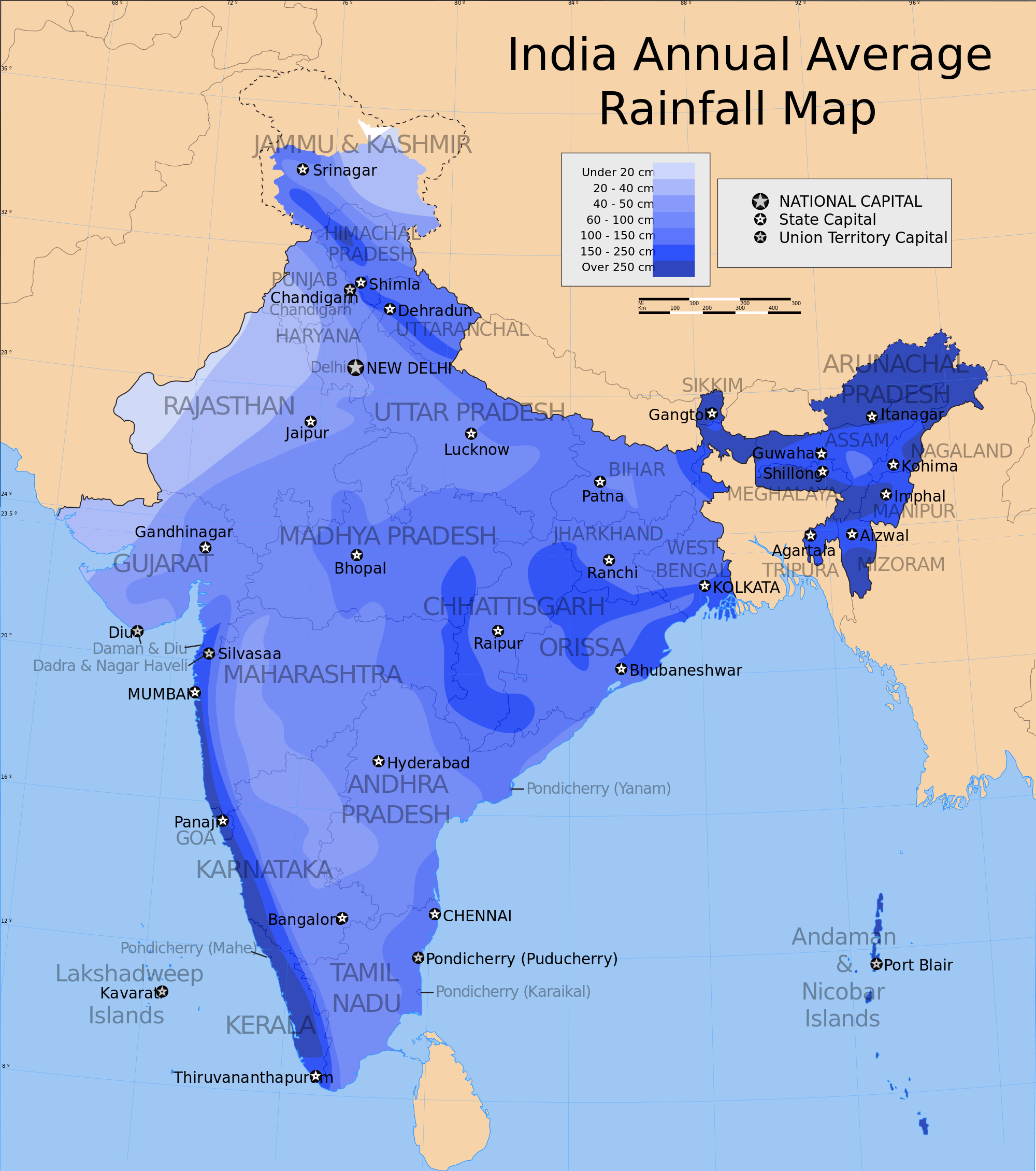
Heat maps are useful for identifying patterns, especially “hot spots” or regions of high concentration of the variable. However, heat maps must be used cautiously to keep data accuracy intact. Building heat maps typically involves using algorithmic extrapolation logic to create a continuous fill of color, often because data sets are discrete. Therefore, the data at any particular point cannot be 100% reliable.
3. Hexagonal Binning
Hexagonal binning is a data visualization technique where you can create a grid in your map with regular hexagons. Once the grid is created, the map can be colored or shaded like a typical choropleth map.
This map represents the changes that took place in individual constituencies (with each constituency represented by a hexagon) from the 2005 UN general election result to the one in 2010.
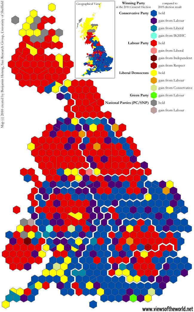
Creating hexagon grids is useful when you have a lot of granular data points but you do not want to compromise on accuracy by using data extrapolation techniques. The hexagon is a preferred shape because it is close to a circle but, unlike a circle, you can form continuous grids with hexagons. However, it becomes difficult to zoom in or out of the visualization by dividing hexagons or aggregating them.
4. Dot Map
A dot map (also called dot distribution map or dot density map) uses a dot to indicate the presence of a variable. Dot maps are essentially scatterplots on a map and are useful for showing spatial patterns.
This is a dot map of the world showing nearly 700,000 geotagged Wikipedia articles, each represented by a yellow dot.
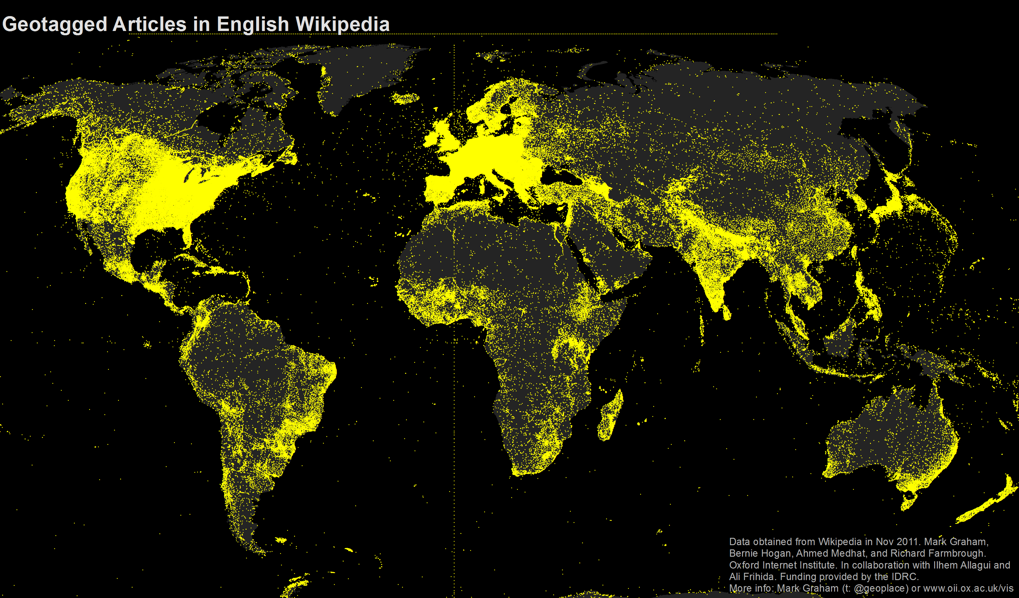
A dot map gives an accurate representation of the value of the variable in granular locations on the map. To ensure location accuracy, it’s important to geocode the data accurately during the data-collection process.
5. Cluster Map
Cluster maps help represent dense pockets of data points using a single point. Each cluster is either relatively sized to or labelled with the number of points that have been grouped together.
This map contains clusters (each cluster represents one village) of varying colors and sizes to show the number of households in Vijayawada. Collect, a mobile data collection tool, was deployed to collect primary household-level data and then create this interactive cluster map with a drill-down to view household-level details on the map.
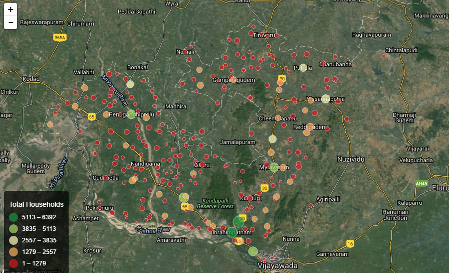
Clusters are ideal in interactive maps where the user can drill down to see individual data points contained in a cluster. Cluster maps help reduce clutter when there are many overlapping data points in a small geography.
6. Bubble Map
Bubble maps help represent two variables — one by varying the size of the bubble and one by varying the color —simultaneously in a single visualization.
In this map of Africa, the size of each bubble represents the number of births in the corresponding country in 2010-15. The larger the bubble, more the number of births. On the other hand, the color of the bubble represents mean age of childbirth in the country. The darker the shade of red, the higher the mean age at childbirth. A quick glance shows that the bubbles are either large in size and light red in color or small in size and dark red in color. This points to a negative correlation between mean age at childbirth and number of births.
Bubble maps help viewers makes sense of three parameters at once through the location, size, and color of the bubbles. However, you must be careful while creating bubble maps that contain many small geographical regions to avoid overcrowding of bubbles.
7. Cartogram Map
In a cartogram, the mapping variable is shown in a diagrammatic form. The mapping variable often substitutes the land area or distance in the map due to which the map gets distorted in proportion to the mapping variable.
The India social cartogram project maps, for instance, contains cartogram maps representing India’s population for different caste groups.

Cartogram overcomes the limitations of other forms of geospatial visualization in that it represents the mapping variable relative to the corresponding geographical area. However, cartograms must be used with care because knowledge of the actual land area is essential for the reader to make sense of the distorted version shown in the cartogram. It is a good practice to show the actual map before introducing the cartogram.
Now that you have these techniques in your arsenal, go ahead, try out these geospatial visualization techniques and re-discover the power of maps!

1 Comment
It’s nearly impossible to find knowledgeable people for this subject,
however, you sound like you know what you’re talking about!
Thanks